Provenir

Provenir
Company
Technology
Industry
Branding / Design / Web
Area
2023
Date
![]()
An AI decisioning platform, specific to the financial and lending industries. Software that determines credit risk, fraud, compliance, onboarding and other tasks within the lending space.
The Mission
A revival of the brand and its strategies.
To update the brand on all levels. Internal and external assets, messaging frameworks, templates, tone, look and feel.
Branding
AI focused messaging with a more serious undertone in look and feel.
The first priority was the website. Switching to a dark mode theme let us utilize the brand colours much better and this led the way for all other assets within the company.
View the Samples
provenir

Brand Guide

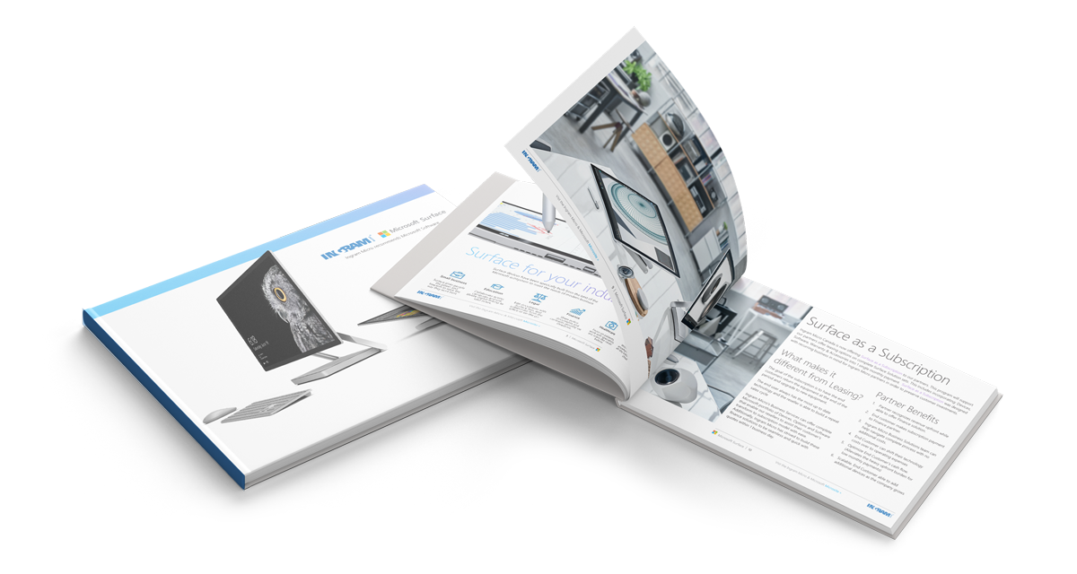
ebook Provenir

infographics Provenir

infographics Provenir
The End Result
A fresh, new look you can bank on.
The main challenge was to take an existing brand guide which consisted of some bright colours and transform them into something a lot more serious and professional. The colour pallette was adjusted to now use a dark theme in the assets to make the brighter colours pop and app still be AODA compliant. These changes were applied to everything from Zoom backgrounds, to email signatures and everything in between.
In the Wild

By switching to a darker theme for the brand, we applied these concepts to print, swag and digital assets.

Added to the Provenir brand spun off sub projects. Below is an internal branding project for a Sales Kick-Off which included a PPT deck, swag, and many digital assets including a gated sales website portal.


SKO-PaperBag

SKO-PaperBag

SKO-lanyard
Another side project for Provenir is the introduction of a program called “CoLab”. This is a road show where 4 cities are chosen and events are scheduled to network, share ideas, discuss trends, etc. The brand direction here is to appeal to C-level personas, hence the serif fonts and professional look and feel.


Colab colours

Colab banners


Programs Used Daily
InDesign
Illustrator
PSD
Ae
PremPro
PPT
Figma
Code